At a Glance
Designing an effective custom flag requires clear, simple visuals that remain readable from a distance and in motion. Common flag design mistakes include using overcrowded text, using low-contrast colours, choosing the wrong size or shape, ignoring wind movement, and submitting low-resolution images. Prioritising clarity, contrast, proportion, and print quality ensures the final flag is visible and a good fit for its intended setting. For well-designed custom flags, contact House of Flags.
How to Make a Custom Flag Without Mistakes
Designing a custom flag might seem simple. You pick the colours, add a logo, include a message, and send it off to print. However, even the smallest flag design mistakes can make a big difference to how your flag looks and performs.
Flags move, fold and need to be seen clearly from a distance to make an impression. If the design is too detailed, poorly coloured, awkwardly shaped, or unsuitable for outdoor conditions, it may lack impact.
Whether you’re creating a flag for your business, an event, a sports team, or a special celebration, it’s important to get the basics right. The ideal design should stand out in any setting and clearly communicate your message.
In this blog, we’ll talk about the top 7 mistakes to avoid in a custom flag design process, to help your flag be bold and effective.
7 Mistakes to Avoid
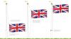
1. Overcrowding With Too Much Text
One of the most common errors in custom flag design is adding too much text. It can be tempting to include your full business name, slogan, contact details and extra information.
However, flags are usually viewed from a distance and move in the wind, making long sentences or small text difficult to read. If people can’t quickly understand your message, the design loses its impact.
Instead of heavy texts, keep your wording short and bold. Focus on one key message or just your brand name. Simple designs are clearer and more memorable.
2. Using Low-Contrast Colours That Reduce Visibility
Choosing colours that don’t look different from each other can make your flag hard to read. Low-contrast colour combinations, such as light grey on white or dark blue on black, can blur together, particularly from a distance.
Since flags are often displayed outdoors and viewed in different lighting conditions, clear contrast is essential. If your text or logo blends into the background, people may not notice it at all.
To improve visibility, you can use strong colour contrasts, such as dark text on a light background or bold colours that stand apart. Following this important custom flag design tip can help your flags be more effective.
3. Ignoring Readability From a Distance
When designing a custom flag, it’s important to remember that most people will see it at a distance. If your text is too small, your font is too fancy, or your logo has too many fine details, it may prove hard to read.
Flags should grab attention quickly, not require close inspection. That’s why it’s best to choose large, bold fonts and simple graphics that remain clear even when viewed from across a street or field.
During the custom flag design process, a good rule is to step back from your design preview and check if it’s still easy to read. Clear, readable flags always work best to attract customers.
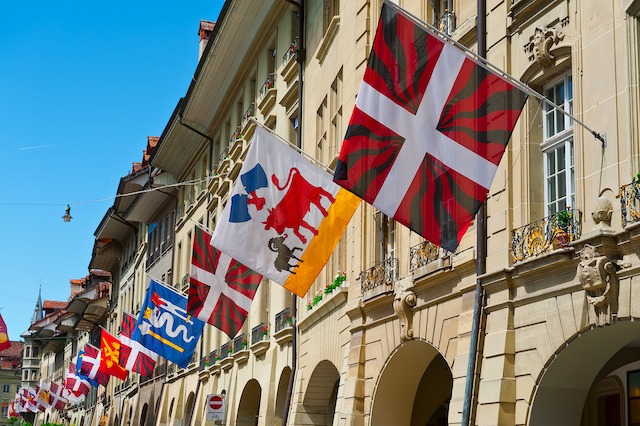
4. Choosing the Wrong Shape or Size
Choosing the wrong shape or size is another flag design mistake that can affect how this advertising tool looks and performs. For instance, a design that works well on a rectangular flag may not look right on a feather or teardrop shape.
On the wrong shape, the logo or important text could get cut off or appear stretched. Size also plays a part, as small flags may not be visible in large outdoor spaces, while large flags might overpower small indoor areas.
Before finalising your design, bear in mind where the flag will be displayed and how much space you have. Picking the right flag shape and size can help your message stay clear and balanced.
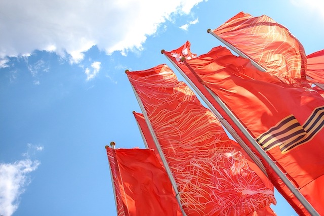
5. Overlooking Wind Movement and Fabric Flow
Many people forget to consider that flags move constantly in the wind. If your design places important text or logos near the edge, they may fold or become hidden when the fabric shifts or twists.
Very detailed graphics can also look distorted as the material flows. This can make your message difficult to understand. To avoid this flag design mistake, it’s best to keep key elements centred and allow enough spacing around them.
You could also choose bold, simple visuals that still look clear when the fabric is moving. Thinking about the effects of wind on your flag will help you design it in a way that’s readable and eye-catching at all times.
6. Using Low-Resolution Images or Logos
Using low-resolution images or logos can ruin the overall look of your custom flag. An image that looks fine on a small screen may appear blurred or pixelated when printed on large fabrics.
Flags are often printed in large sizes, so high-quality files are essential. You should always use vector files or high-resolution images provided by your designer or brand team. Avoid copying images from websites, as they’re usually too small for print.
Choosing high-quality graphics will ensure your flag looks crisp and professional, whether it’s seen from nearby or from a distance.
7. Forgetting About Placement and Viewing Angles
During the custom flag design process, it’s important to think about where it will be placed and how people will see it. Flags displayed high on poles, outside a shop, or at an event may be viewed from different angles.
If your design only works when seen straight on, parts of it could look awkward or unreadable from the side. You’ll also need to consider whether the flag will be single-sided or double-sided, as the reverse side may appear mirrored.
Overall, planning for placement and viewing angles can ensure your design looks balanced and professional, no matter where or how it’s displayed.
For Well-Designed Flags, Call House of Flags
Now that you know how to make a custom flag and which design mistakes to avoid, do you need help creating yours? We’ve got you covered.
At House of Flags, we’ve got decades of experience manufacturing and supplying a wide range of effective promotional products. From banners, display stands and signage to branded flags and more, we’ve got it all!
With our expertise and high-quality products, you can rest assured that your brand will make an impact on your customers.
Explore our range of products and get in touch with us to learn more about our services.