At a Glance
Feather flag readability depends on clear, simple design choices. Small or complex fonts, low colour contrast, excessive text and poor text placement can reduce visibility and limit effectiveness. Focusing on large, legible fonts, strong contrast, minimal wording and layouts that suit the flag’s shape ensures messages are quickly seen and easily understood. To design effective branded flags for your business, call House of Flags.
Feather Flag Artwork Tips
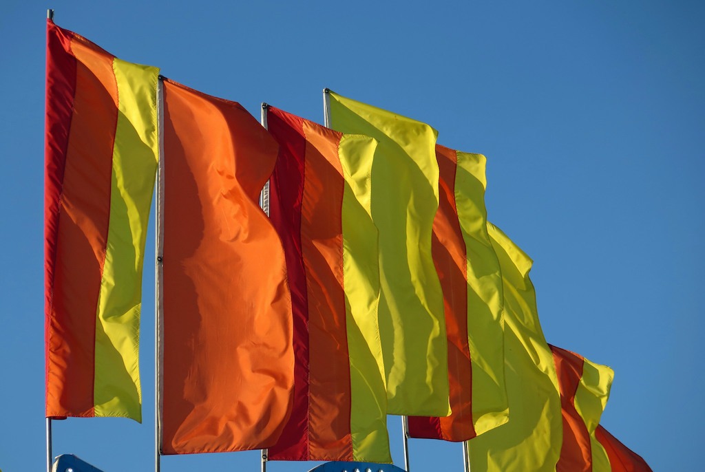
Feather flags are designed to grab attention quickly, even from a distance. They’re often used at events, shopfronts and forecourts to communicate a clear message in just a few seconds. However, even the smallest mistakes can result in surprisingly hard-to-read flag designs.
Poor font choices, cluttered layouts, low-contrast colours or trying to include too much information can all reduce their impact. Instead of attracting customers, a poorly designed feather flag can confuse people or go unnoticed altogether. That’s why it’s important to understand what works and what doesn’t when creating your design.
In this blog, we’ll discuss some of the most common design mistakes and provide practical custom feather flag design tips to help you avoid them. If you get the basics right, you can ensure your flag stands out clearly and delivers your message effectively.
Why Readability Matters in Feather Flag Design
When learning how to design feather flags, ensuring readability is the most important part, as people have only a brief moment to take in the message.
Unlike posters or brochures, feather flags are usually seen from a distance or as someone passes by. If the text is hard to read, the message will be missed completely.
Clear fonts, simple wording and strong colour contrast all help improve readability. When a flag is easy to read, it quickly grabs attention and communicates its message effortlessly. This makes it far more effective at attracting customers and encouraging them to take action, such as visiting a store or event.
Using Fonts That Are Too Small or Hard to Read
Using fonts that are too small is a common mistake in feather flag design. People often try to fit too much text onto the flag, which forces the font size to shrink. As a result, the message becomes difficult to see from a distance. Decorative or overly stylish fonts can also reduce clarity, especially when viewed quickly.
However, feather flags work best with large, bold fonts that are easy to read at a glance. One of the best custom feather flag design tips is to keep the text short and clear, which allows you to use a larger font size. This will make the message more visible and effective for passing viewers.
Poor Colour Contrast That Reduces Visibility

Poor colour contrast can make a feather flag very hard to read, even if the text is large. When the text colour blends into the background, the message becomes unclear, especially from a distance.
For example, light text on a light background or dark text on a dark background reduces visibility. Bright sunlight or low lighting can make this problem even worse.
To improve readability, it’s important to use strong contrast, such as dark text on a light background or light text on a dark background. Clear colour choices can help the message stand out quickly, making it easier for people to notice and understand it at a glance.
Overloading Your Feather Flag with Too Much Text
Adding too much text to a feather flag can make it confusing and difficult to read. People don’t stop to read long messages. Instead, they’ll glance at the flag for just a moment, and if there’s too much information, the key message is likely to get lost. Crowded designs also force you to use smaller fonts, which further reduces visibility.
That’s why one of the essential custom feather flag design tips is to focus on a single clear idea, such as a short offer, keyword or call to action. If you keep the text simple and minimal, it could help your message stand out, making it easier for people to read and remember as they pass by.
Ignoring Flag Shape and Text Placement
Ignoring the shape of a feather flag can make your design much harder to read. These flags are tall and narrow, with a curved edge that can cut off parts of the text if it’s not placed carefully.
If important words are too close to the edges, they may become distorted or hidden when the flag moves in the wind. Placing text straight across without considering the shape can also affect readability.
To avoid this, it’s best to keep your message centred and allow enough spacing around the edges. Designing with the flag’s shape in mind helps keep your text more balanced and easier to read.
To Design a Feather Flag That Gets Noticed, Call House of Flags
Now that you’ve read through our custom feather flag design tips, do you need help bringing your flag branding ideas to life effectively? We’ve got you covered.
At House of Flags, we’ve got decades of experience manufacturing and supplying a wide range of effective promotional products. From banners, display stands and signage to branded flags and more, we’ve got it all!
With our expertise and high-quality products, you can rest assured that your brand will make an impact on your customers.
Explore our range of products and get in touch with us to learn more about our services.